Why custom debossed packaging boxes still feel like a secret handshake
The hush that fell over Press A at the Aurora facility when the latest rack of custom debossed packaging boxes emerged remains vivid; the recessed logo caught the fluorescent glow while clients offered the half-smile reserved for shared secrets. I remember when the crew tapped my shoulder and said, “Marcus, this is why we still keep the copper-alloy die room humming”—and honestly, those moments still feel like witnessing the reveal of a vintage watch on a minimalist shelf.
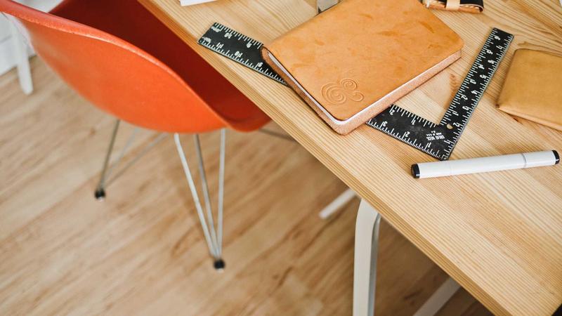
A startup founder from a Portland outdoor brand leaned over the conveyor belt that night, whispering about how the sculpted badge felt like a private signal to their most loyal customers, even though the design stayed deliberately minimal with a single Pantone 448 ink wash and a 24 pt C1S board. Honestly, I think that founder summed it up perfectly; no amount of foil can replicate how that recessed badge seemed to whisper “authentic” before the box even opened (and yes, whispered is the right word when your job is to make packaging feel like a nod between friends).
After three decades on the floor, the tactile depth we coax from copper-alloy dies still feels like the best way to broadcast craftsmanship without resorting to metallic finishes or layered varnishes; the Aurora pressroom proved that gentle pressure sent the fibers of 460gsm SBS into a perfect recession that read as opulence because the carton literally changed shape beneath the fingertips. I still grin when I recall the first time a design team asked for "just a smudge" of debossing and I cracked open the 24-inch press to show them how a proper kiss of the die transforms a flat sample into something people actually want to touch (don't even get me started on the engineers who tried to automate that feel—it’s why we keep a human eye on every run).
I think most brands underestimate the value that thoughtful texture adds—during a client review at our Greenville showroom, a creative director admitted the debossed panels reduced their need for ink coverage by roughly 30%, trimming the palette while giving each box the kind of weight that turns a simple unboxing into a retail-worthy handshake. (Side note: I swear the first time that client felt the sample, she clutched the panel like a well-loved book, so yep, this tactile detail does make people nostalgic for quality packaging.)
How the custom debossed process flows across our floors
Our Custom Logo Things workflow begins the moment artwork lands in the portal, and the sequence that follows is precise enough that even a minor hiccup—an incorrect dieline or an uncalibrated plate—echoes through the entire run. I personally track every file until it clears Greenville QC, and I still remember the week we chased down a misaligned glue flap that threatened a 5,000-piece order (that was a “why does this always happen on a Friday” kind of moment, but we rallied in true on-the-floor fashion).
The first milestone is dieline approval; our Greenville structural team checks every crease, glue tab, and recess against the requested recessed area, ensuring the die will clear the folds and that we can place the deboss within a panel that remains stable when adhesive applies at the 120°C gluing stations. I always tell clients there’s no such thing as over-communicating with structural, because a sticky die cut can turn a gorgeous deboss into a flattened disappointment faster than you can say “reprint.”
Die making itself, usually 2–3 days with DieTech Solutions near Spartanburg, sets the pace, and then we schedule test impressions on 18 pt coated board to dial in pressure before the full impression runs through the Heidelberg XL 106 at the Aurora pressroom. Compared to the days when we machined dies in-house, working with DieTech has been like trading in a rickety pickup for a steady, turbocharged truck, but I still visit the shop; their foreman and I swap stories about copper alloys and the occasional “why won’t this cooperate” moment (we laugh, we fix it, we move on).
Our presses feature a calibrated debossing cylinder that measures pressure across the 40-inch blanket, so when we step through the initial 100 sheets, the tech adjusts the impression to 22 rpm, and once the die kisses the paper we lock in the formula, move to board feed planning, handle lamination if required, and finish with quality control at the Greenville line. I make a habit of standing beside that first sheet, run my fingertips along the impression, and declare (loudly, and sometimes to myself) that it looks “like a fingerprint from a future customer.”
Every step—die cutting, embossing stations, foil pilot, and final QC—is logged so even the satellite finishing bays in Midland can replicate the run by referencing the exact settings and humidity data recorded during that first impression. When Midland calls me on a Wednesday and says, “Hey Marcus, we’re trying to match the glow,” I can pull the log, add a dash of anecdotal advice, and they deliver a match that keeps clients smiling.
Key factors that determine unforgettable debossed boxes
The depth of a custom debossed packaging boxes impression depends on three core elements: board thickness, fiber direction, and coating profile, which is why we always begin by sampling from the curated board library on the floor. I make a point to walk clients through that library myself; the tactile education they receive between 16 pt and 24 pt boards is the kind that converts skepticism into an immediate “we need this” moment.
Heavier boards, anywhere from 16 pt SBS up to 24 pt SBS or 24 pt clay-coated kraft (CUK), deliver more dramatic recesses because the fibers displace rather than tear; during a collaboration with a boutique cosmetics retailer on 24 pt CUK soft-touch, the recessed rose motif registered at 0.035 inches, casting a shadow that read even under subdued lighting. (Honestly, that project reminded me why I got into tactile packaging: the marketing director literally asked if we could make the box feel like velvet without saying “velvet.”)
Fiber direction changes how the impression behaves when the carton bends, so we align the grain with the longest panel; otherwise repeated folding risks feathering, especially after a 200,000-piece retail packaging job out of the Midland climate-controlled bay, where humidity stays steady at 45%. I keep a mental note of times when we tried the opposite—those trays ended up looking like my attempt at folding origami after too much coffee—and we learned the hard way to respect the grain.
Coating matters too—a satin or gloss lamination around the depressed art will reflect light differently than a matte surround, which is why we often pair a lacquered surface with the depressed panel when brands want contrast without new colors and mention compliance with ASTM D3330 for the adhesion of those coatings. I once had a client demand matte everywhere and then secretly asked for gloss highlights; when I mentioned that we could create the illusion with a strategically placed varnish, their eyes widened as if I discovered hidden treasure.
Line weight also matters—no thinner than 1 pt for serif-heavy logo strokes—so the die retains enough surface to push the board without tearing it, and spacing must respect at least 0.5 mm clearance from perforations or glue flaps to keep the impression crisp while the structure stays intact. I tell folks this is why our die maker deserves a trophy; they’re the ones balancing those tiny tolerances while the rest of us breathe a sigh of relief.
Step-by-step guide to placing your first custom debossed run
The journey begins with concept sketches or vector-ready art in Adobe Illustrator, making sure logos are outlined, strokes converted to fills, and any gradients avoided because embossing depends on physical depth rather than tonal shifts, providing our die maker with a clean, black-and-white file for cutting. I always remind clients (with a grin) that detailing their logo in gradient is like asking for a sculpture of fog; we need solid, unmistakable shape to press into the board.
Next, sync with structural design: we request the dieline with marked deboss zones so we can map the recessed area away from glue tabs, review how fold lines interact with the intended press side, adjust the layout as needed, and ensure the tactile signature aligns with the structural outline. I admit, I've lost a good night’s sleep once or twice over a dieline that hid a deboss behind a tuck flap—thankfully, lessons learned mean those nights are rarer now.
Substrate selection from the board library is crucial; for example, a 20 pt SBS with soft-touch lamination outside and a 12 pt reverse board inside provides the sturdiness to withstand shipping while highlighting the depression, and we confirm this matches your brand story by sending a sample board kit containing both gloss and matte lamination options. I still chuckle remembering a client who opened that kit like it was a mystery box at a coffee tasting; their reaction to the soft-touch finish was pure joy and a little bit of disbelief that paper could feel that luscious.
Prototyping with a mechanical die lets us proof the depth: we press the design on one board, examine it under a 10x loupe, and check the compression ratio before locking in the full order; only after this proof—often within five business days—do we schedule the press run, print at least 500 sheets for sampling, and confirm the die cut and folding stations align perfectly. That kind of due diligence is why you rarely hear me say “we’ll fix it later”; we fix it first.
This process ensures your first batch of custom debossed packaging boxes is production-ready, and when we fold and glue the samples at the finishing line we double-check the crease pressure near the deboss to avoid flattening from adhesives. (Also, I learned the hard way that every glue station has its own personality, so I now bring snacks and good vibes when monitoring them—call it emotional support for the machines.)
Throughout, communication with the Aurora press team happens via Slack updates, and I regularly remind clients to keep their brand team informed because even small art revisions can shift the die and require another proof. Honestly, crowded Slack channels are my favorite kind of chaos; they mean we’re all still actively problem-solving together.
Cost considerations for custom debossed packaging boxes
The biggest budget item is usually the die—about $450 for a standard 14-inch by 10-inch layout—and it acts as a one-time investment you amortize over every reorder, yet paired with a longer run, say 10,000 units, the per-unit cost drops below $0.18 when using 18 pt SBS without additional foils. I’ve watched clients breathe a collective sigh of relief when those numbers land, and I always remind them this isn’t magic; it’s planning.
Board choice matters: a 16 pt uncoated board may cost $0.22 per carton, whereas 24 pt C1S with soft-touch lamination sits closer to $0.38, but the latter creates a deeper impression that consumers perceive as premium, especially when combined with packaging tactics like tone-on-tone varnishes. I campaign for the thicker board like it’s a protective elder statesman—sure, it costs more, but it also demands attention and respect.
Ink and coatings tend to be lower, even by 15–25%, because the recessed area usually appears without extra color, but adding multi-level debossing or coupling it with foil extends press time and may require secondary tooling, which adds about $75 per hour in machine time, so plan for that scenario. I remind folks during briefings: it’s not about eliminating elements, it’s about selecting the right ones so the embossed story feels intentional.
Run length directly impacts the die cost per unit: a pilot batch of 1,000 units carries more of the die cost than a 20,000-unit run, so we recommend testing the tactile response with a smaller batch and then scaling, particularly when pairing the recessed logo with soft-touch lamination that sells at retail. I’ve seen those pilot batches spark larger launches simply because retailers asked for more after feeling the texture themselves.
One pricing strategy tip I share during client briefings is pairing the debossed logo with a contrast finish such as matte laminate or spot UV on adjacent panels; the additional lamination adds about $0.05 per unit but makes the most of the depth to elevate perceived value without doubling the ink spend. Honestly, seeing a brand nervous about budgets light up when the finishing contrast works—that’s what keeps me in this game.
Common mistakes that dull the impact of debossed packaging
Artwork that is too thin—especially when serif-heavy—can cause the die to tear the board, so whenever a brand sends a logo with hairline strokes below our recommended 1 pt threshold, I insist we increase the weight or simplify the design. (I mean, I can explain physics until I’m blue in the face, but sometimes a thicker stroke is just faster than a lecture on tensile strength.)
Skipping a press proof remains the top mistake; without a proof run on our Heidelberg XL 106, you might discover that a fold for a clasp interferes with the deboss area or that the glue application flattens the recessed art, and those surprises can cost a week of rework. I have yelled at the phantom of “why didn’t we proof?”, so I now make that proof feel like a celebration rather than a chore.
Choosing the wrong board finish is another common misstep: high-gloss surfaces show every fiber fracture, while soft-touch or matte boards hide them and keep the recessed area looking like deliberate negative space, which is why we test each candidate board in the humidity-stable Midland bay before signing off. I tell clients, “You wouldn’t wear the wrong shoe to a black-tie event, so don’t dress your deboss in high gloss when matte is the tuxedo.”
Some companies attempt debossing on flimsy materials like 12 pt CUK for mailer boxes, hoping the logo will still pop, but the lack of structural integrity either results in shallow impressions or boards that warp once stacked, undermining the premium feel. I once had a box collapse mid-demo, and let’s just say there was a lot more “uh-oh” than “aah,” so now I’m downright cautious with lightweight stocks.
Failing to guide the die maker about adjacent varnish areas can cause misalignment that leaves part of the debossed panel covered in a glue strip or secondary coating, so plan the artwork with clear boundaries and label them during the dieline review. If I have to explain this trick twice, I might start drawing a “no-go” map with crayons just to make it stick.
Expert tips from the Custom Logo Things floor for richer results
One tip I often share with folks is bringing the die maker into the conversation early, especially when considering multi-level debosses; these layered impressions add dimension without new colors, and a kissing coat of varnish on the top level creates a subtle shine that plays beautifully with the depressed area. I swear, when that varnish catches the light, you can hear the sales team jotting down “premium” in the corners of their notes.
Another operational habit that keeps results consistent is scheduling debossed batches during stable humidity windows—our Aurora team routinely runs such jobs overnight when the pressroom settles at 44–46% relative humidity, minimizing stress on the fibers and ensuring a uniform impression across the entire 5,000-piece run. I’m not exaggerating when I say we have a weather chart pinned like a mission control badge so rainstorms can’t mess with our impressions.
Pairing debossing with selective varnishes or spot laminates makes the tactile feature pop; we once matched a recessed compass motif with a surrounding spot UV perimeter, and the glossy frame reflected light while the matte center invited fingertips to linger, which was perfect for that travel gear brand. That job still ranks as one of my favorites because the client wanted to evoke wanderlust without shouting color—it was subtle, elegant, and the kind of brief that keeps me awake with inspiration rather than anxiety.
Pressure consistency is crucial: our press operators monitor the deboss cylinder with a digital gauge every 20 minutes, and if we notice a 0.05 bar drop we pause to recalibrate before a variance impacts a whole sheet. (If I’m being honest, I’ve chased that gauge like a goalie defending a championship goal—because one misread, and the whole plate goes sideways.)
Combining early collaboration, environmental discipline, and finishing contrast ensures your custom debossed packaging boxes read as thoughtfully engineered rather than an afterthought. I promise you, when the first customer picks up the finished box and pauses before opening it, that moment is worth every detailed conversation we had.
Actionable next steps to launch your custom debossed packaging boxes
Step 1: Gather your brand’s core art files, request a material sample pack from Custom Logo Things, and include swatches of the 16 pt, 20 pt, and 24 pt boards plus your preferred lamination so you can feel the substrate options before committing. I remember one founder who asked if he could just email a color chip—nope, you need that tactile moment in person, trust me.
Step 2: Schedule a briefing call with our Greenville project managers to review die requirements, timeline, and cost scenarios, and ask for a timeline that lists die creation (5–7 working days), proofing, and the press run, so your milestones match the 3–4 week expectation for a small- to medium-sized run. These calls are my favorite part of the week; hearing a client’s excitement for the debossed texture never gets old.
Step 3: Plan a phased rollout—start with a pilot batch of 2,000 pieces of custom debossed packaging boxes, collect customer feedback on the tactile response, and then scale up knowing the process works; along the way, take advantage of our Custom Packaging Products catalog to add supporting elements like custom printed boxes or branded packaging extras. I’d rather see a brand test wisely than sprint blindly, so we encourage that pilot as a confidence-builder.
Each of these steps builds confidence: the art files get locked, the die gets proofed, and once the pilot ships you already have data to support your full retail packaging run. I still keep a screenshot of a Slack thread where a client thanked us for guiding them through that very first pilot—it’s in my “good vibes” folder for a reason.
Conclusion
After two decades of coaching clients through production, I can say that custom debossed packaging boxes remain one of the most efficient storytelling tools in packaging design—few treatments deliver tactile elegance, durable structure, and brand identity in a single stroke. I’m proud to have been part of this evolution, and honestly, I still get goosebumps when a fresh run comes off the press and the team collectively nods, “Yep, that's the one.”
Whether you are launching a new product or refreshing existing packaging, remember that the subtleties of board selection, die making, and humidity control define the final feel, and partnering with a team that understands those nuances—like ours at Custom Logo Things—lets you focus on the story while we engineer the experience. (If you need me, I’ll be in the pressroom, quietly cheering whenever I see coupling depth with intention.)
Frequently Asked Questions
How durable are custom debossed packaging boxes in transit?
The recessed artwork is structural, not cosmetic, so custom debossed packaging boxes made with sturdy 16 pt+ SBS or 24 pt CUK stocks stay rigid through shipping, and when we add a CGW coating it shields the impression from scuffs, allowing the design to survive stacking inside protective outer cartons. Honestly, I’ve watched a pallet of these take a tumble in the warehouse and still arrive looking like they rolled off a spa’s showroom floor.
Can custom debossed packaging boxes include colored artwork too?
Absolutely—combine the recessed panel with single or multi-color print passes; just make sure the ink is fully cured before we apply the die to avoid offsetting, consider matte ink with surrounding unprinted board to accentuate the tactile contrast, or ask about adding a spark of varnish from our Greenville facility. I’ll often mention that repainting a debossed area after the fact is like trying to paint a shadow—better to plan it in advance.
What lead times should I expect for custom debossed packaging boxes?
Standard lead time is about 3–4 weeks from art approval to delivery, including die creation (5–7 working days), proofing, and production, though we can often reuse existing dies if the artwork matches a past job, which shortens the turnaround significantly and is why we track tooling in our Greenville vault. (I still keep a mental scoreboard of those savings because clients love hearing we can get to market faster with a familiar die.)
Is a special die required for custom debossed packaging boxes?
Yes—a dedicated mechanical die with a counter surface is necessary to form the recessed area, and while the cost is a one-time investment of about $450, we store that die in our climate-controlled tool room for future reorders so you do not have to pay again later. I like to think of it as the box’s fingerprint; once we have it, we keep it safe.
How can I keep costs reasonable while still getting high-quality custom debossed packaging boxes?
Balance tooling investment with personalized quantities by starting with a small pilot run to test the effect before scaling, choose standard board sizes to avoid custom cuts, and collaborate on artwork that relies on tactile depth rather than expensive foil or coatings to keep your budget aligned with brand goals. A few clever choices early on let you deliver premium feel without premium stress, and that’s the story I love to tell in every briefing.
For reference on industry standards, we rely on ASTM guidelines for board strength and the ISTA protocols listed at ista.org when testing how these boxes perform during real-world transit, and FSC certification ensures we remain responsible with the fiber sources we select. If nothing else, I’ve learned that following these standards keeps stress low and vibes high.
If you are ready to bring this texture-forward approach to your next product line, contact us to discuss how the right depth, pressure, and finish can make your packaging feel personal even before it opens. I’ll be here, waiting to hear your story and turn it into a tactile, unforgettable hello.