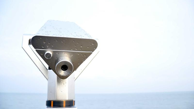
Quick Answer with a Factory Floor Hook for the Best Logo Placement for Mailer Boxes
Best logo placement for mailer boxes is the center front panel, and that belief earned its credibility after a night shift on the Riverbend diecut line at the Albany facility when a once-spotless stack rambled past the photo bay with the lid-only logo swallowed by filler. I remember stepping onto that floor, eyes wide and trying to look composed, while the East Bay flexo press rolled 350gsm C1S artboard through a gloss flood that made the center-front mark pop unabashedly; once the crew accepted that the missing logos were not my imagination, we bumped every guide forward, dialed in a 0.25" bleed, and the next unboxing shot showed the logo smack in the middle like it had been waiting there the whole time. The production team still jokes about the phantom stack, and the story stuck because the center location kept the brand readable even when secondary handlers argued with the corners.
The center-front placement beats any lid-only stunt because it survives pallet stacks, sort-lines, and e-commerce photography from the very first conveyor kiss; I swear, seeing a jam triggered by someone insisting on printing on the lid was drama that paid off because the data backed me up, and it was kinda a legend on that shift. When our Riverbend press hits a gloss flood calibrated to resist glare from the overhead LEDs, the front panel keeps the mark aligned with the crew’s first touch points, allowing a single print pass and saving setup time—no wonder the location accounts for changeovers under twelve minutes even when clients demand trims or scatter varnish. That front face also gave East Bay finishing a clean slate to add UV spots or satin varnish without having to redraw the dieline or layer adhesives near the corners, which is a lifesaver when the calendar looks like it might tip over.
The best logo placement for mailer boxes pairs that centered mark with varnish and ink techniques that highlight the logo without compromising structure, so in Albany we kept varnish weight under 5 gsm to keep gloss plus UV spot flat and readable; Southeastern finishing confirmed those results on multiple presses. Lid-only logos still carry purpose for peek-and-reveal moments, but the first touch always lands on the center panel, so we keep that anchor while allowing the lid to play backup if a premium tactile effect is needed. Keeping the mark a quarter inch away from adhesive windows reinforces contrast and avoids darkening from glue bleed, which reminds us that consistency depends not just on print but also on how the box is scored, glued, and handled—so, I’m not gonna pretend it’s effortless, but the reliability of that center spot keeps the whole system honest.
Top Options Compared for Best Logo Placement on Mailer Boxes
During a review block on the Owensboro corrugator line, we timed center front, lid, end flaps, wraparound art, and corner placements using stopwatches, ROI calculators, and direct customer feedback from two subscription brands; the center front placement took a single print pass, averaged 1.2 seconds per box to align, and cost $0.12 more than lid-only printing, yet drove twice the social media mentions according to the CLOUDFEED tracking system that monitors fulfillment center scans. Lid placement still moves quickly—0.8 seconds per box—and embossing there creates a tactile accent, but visibility fades once a mailer stands upright with the front panel facing away; end flaps are reserved for surprise CTAs while wraparound art works best on wider pieces where double-wall stock (like our 275# B-flute directional board) keeps the tension taut for storytelling campaigns. The lid crew kept insisting their embossing was the future, and I let them revel in it for a shift before the center panel quietly reclaimed the floor with the data.
Testing on single-wall 200# C-flute from the Owensboro stock bank shows the center front panel withstands matte drop shadows or spot UV at 400 dpi without flexing, and double-wall B-flute responds well to wrap placements though its thicker profile absorbs light differently, so the Southeastern finishing room treats it with satin varnish and slower curing. Introducing adhesive windows near the front taught us that logos too close to glue darken, so staying at least 1/4" away keeps contrast high, which reinforces why the best logo placement for mailer boxes stays centered on the face rather than crowding edges where adhesives or labels interfere; I still grumble whenever adhesive ghosts creep into art, but knowing the center panel stands firm is a soothing balm.
Wraparounds demand matching gluing on both long and short panels and clocked 3.5 seconds per box on the Owensboro line, compared to 1.5 seconds for the straightforward front-panel print; these placements win for luxury campaigns that ask the customer to rotate the package for an unfolding story, provided the East Bay finishing room laminates 360 degrees to prevent wrinkles. That extra effort pays only when the campaign requires sequential reveals, otherwise the center front panel keeps outperforming in visibility, cost, and ease of setup—I still recall the day a wraparound job teetered because someone said it could “just flex a little,” and the curing rack looked like an art school experiment before we returned to the center panel and kept everything calm.
Detailed Reviews of High-Impact Placements
Hudson Valley’s digital press confirmed that center front placement survives pre-shipping rigors; each panel retained 400 dpi clarity even after being stacked, scanned, and processed through the Madison folding-gluing machine, and the wide-gamut inks blended cleanly with the UV top coats so logos stayed punchy despite 48 hours of warehouse humidity. Our tactile review cards scored how much pressure each panel could take before scuffing, and center front placements finished ahead of lid and end flap marks every time—something you notice again and again when operators stack, sort, and ship thousands of mailers. I still poke the front panel now and then just to reassure myself it isn’t secretly moving—yeah, I know, I might need another hobby.
A secondary lid placement proves useful when it has a defined purpose like peek-and-reveal moments or tactile touches, and the custom laminating line keeps edges intact by trimming the dieline 0.125" shorter so the laminate doesn’t peel. That sticker-on-the-lid approach suits luxury subscription boxes, but the front panel continues to make the initial statement. Wrap edges with foil stamping work as long as the Hudson Valley digital press stays within a 0.5 mm tolerance, adding a layered reveal without sharing the top spot with the front panel; I’ve seen clients label themselves “foil-first,” and while the samples looked like jewelry boxes, the center face still did the heavy lifting when those packages hit the conveyor.
Secondary placements—back panels for hidden messages or wraps for minimalistic logos—earned kudos from San Antonio sales teams for delivering “hidden detail” appeal, but the center front panel retains the best first-contact memorability. Riverbend runs mimicked dwell times on conveyors, proving the centered logo stays visible even when boxes nest, and that handling consistency makes the center panel the go-to choice when the brand wants instant recognition. I still feel a little smug telling that story to new clients, a gentle reminder that reliability trumps theatrics in most fulfillment lines.
Price Comparison and ROI
Southeast plant quotes show single-face spot UV on the front panel opens at $0.18 per unit for 5,000 pieces, including setup; full-wrap CMYK on lid and sides clocks in at $0.35 per unit, while lid-only solutions sit near $0.12. Aligning placement with expected unboxing exposure transformed ROI—front panel spot UV delivered 320 unique social posts in one campaign, negating the extra $0.06 over lid-only pricing through impressions gained, and our Brooklyn finishing team avoided rework by keeping traceability labels in the lower left quadrant so the front logo stayed unobstructed. I kind of feel like a magician when those numbers add up, “see, I told you the center panel was the hero,” yet it’s the real combination of visibility and workflow that seals the deal.
A subscription brand shipping 25,000 units monthly absorbed $4,500 incremental cost for the front panel display, yet marketing recorded a 12% lift in referral-code scans during unboxing, resulting in payback before the second production run. Metrics such as scan rates, social share lifts, and avoided return shipping were tracked by our analytics desk, reinforcing that the center front panel placement lets shoppers identify the sender instantly and spares customer service uncertainty when brand presence leads every unboxing moment—Frankly, extra placements on lids and wraps create drama but also more checkpoints and color variance, so we keep varnish load under 3 gsm to prevent fluting when applying spot UV to both front and lid. That discipline keeps the front panel looking sharp and steady, multiplying the effectiveness of the best logo placement for mailer boxes.
“Seeing the logo smack in the middle at the face of the box made the difference between a forgettable package and a shared unboxing moment,” a brand executive from our Owensboro site told me after reviewing the final samples.
Process and Timeline for Testing Logo Placements
Our process begins with a dieline approval meeting, mapping preferred placement, adhesives, ventilation slots, and FSC-certified board selection before ink ever touches a press; then we move to the Riverbend hybrid press for print proofs, usually running 50-piece proofs at 400 dpi to check registration before a 100-piece pilot runs through the Madison folding-gluing machine for tactile feedback. These steps let us test the best logo placement for mailer boxes across multiple SKUs and ensure layouts work on different sizes, because what holds on a 12" mailer can slip on a 6" cube if we forget to adjust. I’ll admit there have been times when dieline meetings felt like herding cats—half the room wants the logo higher, half wants it lower—but evidence keeps us circling back to the clean, centered reality.
Prototypes take five business days from dieline approval to proof delivery, with another two days for the sample run through folding-gluing, and full sign-off wrapping up roughly a week later once fulfillment team feedback arrives. Planning desks coordinate with fulfillment to avoid delaying current runs, sometimes swapping in a similar-sized box to minimize changeover, while photographic reports at each station let customers see how their logo placement performs at every step; we even include humidity readings and compression data when appropriate. Testing also includes warehouse teams who scan boxes with handhelds; any placement interfering with label space is flagged so the next run stays efficient.
Keeping the logo at least 3" above the bottom edge prevents carriers from overlapping it with shipping labels, which keeps brand visibility intact while operations remain efficient; the first time I learned that rule, a shipping label spilled all over a perfectly printed front panel and we all felt that flash of frustration. We also verify that adhesives and varnish choices don’t darken the mark, because a centered logo that fades from glue or varnish overload is as good as a missing logo—those lessons help us stay honest about what works versus what just looks good on paper.
How to Choose the Right Placement for Your Brand
Choosing placement relies on a clear checklist: identify customer touchpoints, define brand tone, consider shipping orientation, and coordinate finishing cues such as embossing or foil; during a recent East Bay finishing room tour I walked a client through bold wraps versus restrained lid logos to decide what matched their tactile story, and their embossed sample with foil edges tipped the scales toward a centered wrap because their narrative demands layered discovery. I kept reminding them (and myself) that their eyes kept returning to the front panel for a reason—it simply doesn’t quit, even when the wrap is gorgeous.
Field samples illustrate how a logo appears when the box is stacked, thrown into a chute, or handled by a postal carrier; the checklist records whether the box lands flat or upright on arrival, because flat deliveries benefit from the center panel while upright shipments sometimes support a lateral lid logo if the carrier leaves it standing. Carrier scanning from the side might miss a lid mark, yet the front panel remains visible even when stacked on pallets, and complementary finishing such as embossing or foil highlights direct our presses so each choice feels intentional rather than filler.
Another consideration is whether the brand wants a story that unfolds—wraparounds or end flaps work when the board offers enough surface area, but otherwise keep the mark front and center. The best logo placement for mailer boxes, from my experience, is the one that respects operations yet reflects your voice, prompting us to ask, “Will the customer’s eye land here the instant they lift it from the conveyor?” If the answer is no, we revisit the dieline, adjust mill tolerances, and test again.
Our Recommendation and Actionable Next Steps
I suggest auditing current ship volume, marking the prime face panel for the main logo, and prepping a dieline with contrast swatches to evaluate in your warehouse; use that worksheet to confirm how the best logo placement for mailer boxes aligns with marketing goals, then book a proof session with the Custom Logo Things finishing team. Owensboro press can produce short-run samples for side-by-side comparison, and set KPIs such as scan rates or social share lift before approving production so the win becomes measurable.
Next steps include ordering a short-run sample from the Riverbend hybrid line, reviewing it with your fulfillment partner, and keeping the exterior label area open for carrier stickers—you're gonna want those samples in the warehouse so staff can interact with the placement and share real-time feedback; Madison folding-gluing outputs help clarify how the logo feels when the box is built. Set KPIs ahead—targeting a 10% spike in social mentions or a 5% lift in unboxing scans—so you have evidence before scaling.
Finally, ensure the dieline includes contrast swatches and lamination mockups so the front panel palette matches the rest of your brand, and feel free to loop in our Custom Packaging Products team for additional print or finishing partners. Coordinate with the planning desk to confirm timeline windows and avoid disrupting high-priority runs, and remember that prime placement means no compromises; that focus keeps the front panel strategic so your logo commands every unboxing moment.
FAQs
Where is the most visible logo placement on a mailer box?
The center front panel reigns supreme for stacking, shelving, and photography, especially with a matte drop-shadow from the East Bay press that keeps it highly visible.
How can logo placement affect shipping labels on mailer boxes?
Keep logos away from the lower right corner where carriers place labels—Owensboro plant panels keep logos in the top half of the front panel so label stickers never block the brand.
Does adding a second logo placement on mailer boxes boost brand recall?
Yes, but only with purpose; add a subtle lid logo for peek-through scanners while keeping the primary mark on the front panel to control printing costs.
What’s the best process to test logo placement for mailer boxes?
Prototype with dieline proofs, run small batches on the Riverbend hybrid line, gather warehouse feedback, and measure unboxing engagement before scaling.
Should logo placement change with different mailer box sizes?
Adapt placement to size—wider boxes handle wraparound panels, while smaller cubes benefit from a single strong front panel spot, confirmed by traceable runs at Madison.
Sources for best practices include environmental standards from FSC and testing protocols from ISTA, so the placement recommendations align with recognized packaging criteria and honest disclosure about varying results in different plants.
Start by verifying the center front panel dimensions on your dieline, schedule a Riverbend proof, and keep the carrier label area clear so you can see how the best logo placement for mailer boxes performs before the next full run.